Dyslexie: A New Typeface Helps Dyslexic Children Read
It’s estimated that 10% of the Australian population have dyslexia. Dyslexia is best understood as a persistent difficulty with reading and spelling.
In the US, 40 million adults are dyslexic and only 2 million know it. The good news is, for those that do suffer from dyslexia, a new type of font is on its way to make reading easier.
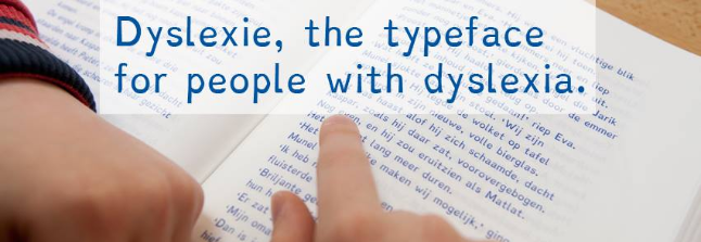
Dutch graphic designer Christian Boer, who is dyslexic, has developed a typeface to correct the array of fonts available in print media. Individuals who are dyslexic, view letters as 3D objects, and as some letters are based on others, an individual can get them mixed up. Dyslexie is a typeface that emphasizes individual differences of letters by enhancing them so the reader knows which letter is which.
Letters like ‘p’ and ‘d’ have a bold bottom, and letters like ‘h’ and ‘n’ are lengthened and letters ‘I’ and ‘j’ are slanted.
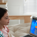
Three quarters of the students surveyed who read the typeface had fewer mistakes from reading and pronouncing.
The font is available for free from the Dyslexie website. It’s worth trying with your child to see if it helps them with their reading if they are struggling.
